Check Box Widget
Geomant does not support this feature at this time. For more information about the interaction widgets, please contact us at supportdesk@geomant.com.
With the Check Box widget you can create interactive check boxes. In your content you can check none, just one, or multiple check boxes of the same Button Group.
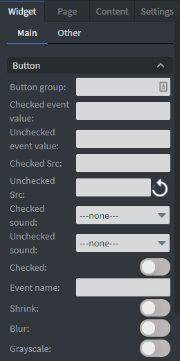
- In the Button menu you can set the name of your button group as well as an unchecked value and a checked value.
- You can set your widget to be checked at the start of your content. You can upload a checked and an unchecked image here.
- You can also shrink, blur, or make your widget grayscale while it is unchecked. Event name is not necessary to fill.
- If the check value is empty but the Checkbox has been checked it will get the default 'Checked' string.
- You can set a Checked and Unchecked sound which will be played when the widget goes to the checked/unchecked state.
See more about: Interactivity.
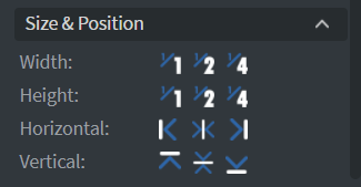
In the Size & Position menu you can select the width, height, and placement of your widget quickly. See more specified information about: Size&Position.
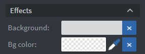
In the Effects menu you can select a background image or color for your widget.
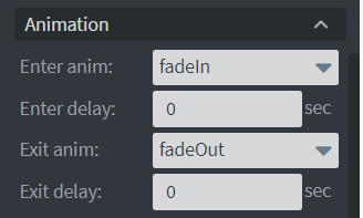
In the Animation menu you can choose the enter and exit animations of your widget. See more specified information about: Animation.
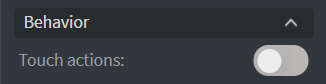
In the Behavior menu you can set Touch actions for the widget. See more about: Interactivity.