Interactive widgets and touch actions
Interactive widgets
Widget types
Checkboxes
A checkbox widget can be checked or unchecked. Repeatedly pressing a checkbox will toggle it between these two states.
When submitting, the event name and either the checked or unchecked event value will be sent. For example, if the below checkbox was checked, {info: show} could be sent to your API. Also, the "info" column in the downloadable .csv file will contain "show".

If there are two ore more "Checkboxes" in a "Content" with the same "Event name", "Checked event value" and "Unchecked event value", they are considered to be the same, and if one of them gets checked or unchecked, the others will follow suit. This way you can have the same checkbox across multiple "Pages" or add some nice visual effects: checking a small "Checkbox" with a label next to it can also make a bigger visualization appear somewhere else. To achieve this, the connected "Checkbox" has to have a transparent image as its "Unchecked src" and the visualization as "Checked src".


Checkboxes can also have a "Button group", which can be sent out to API calls, if needed. Also, it will be taken into consideration when deciding if two "Checkboxes" are identical.

A "Checkbox" can start in "checked" state. It will also reset back to checked when a "Submit" or "Reset button" is pressed.

If a "Checkbox" is "unchecked", it will display its "Unchecked src" image. In addition, you can also turn on these options. They are most useful if the "Checked and unchecked src" is the same. You can easily set the "Unchecked src" to match the "Checked src" by pressing this icon shown below.

Radio buttons
"Radio buttons" usually come in groups. In a group, only one "Radio button" can be selected (checked) at a time. If one of the buttons in a group is pressed, the others will become unchecked. Repeatedly pressing one "Radio button" usually won't accomplis anything.


A "Radio button's" most important properties are "Button group" and "Checked event value". Usually, you want to have multiple "Radio buttons" with the same "Button group" and different "Checked event values". When submitting, only the one "checked" "Radio button's" "Checked event value" will be sent out as the value belonging to the "Button group". For example, with the above two "Widgets", the sent out data would either be "{direction: left}" or "{direction: right}", depending on the currently selected one.
In regards to starting out "Checked", having "Shrink", "Blur" and "Grayscale" options, "Checked src" and "Unchecked src", they work the same as "Checkboxes". Also, identical "Radio buttons" will become "checked" to be consistent with the pressed button.
"Radio buttons" also have a "Jump to" option. Here, you can choose from the other "Pages" in this "Content". When this button is pressed, in addition to becoming selected, the "Content" will also jump to the selected "Page". Also, "Event name" will be logged into the "Content interaction" log.


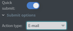
You can also turn on "Quick submit" and choose from the same options as for a "Submit button". This can be used in a simple "Content", such as a customer satistaction survey at a checkout line with 3-5 choises, submitting automatically when any of the buttons are pressed.
User input
If you need any other input from your users, you can add a "User input" widget that lets them type in something. It can be useful to get their e-mail address or a comment regarding their order.
A "User input" has an "Event name", this will be used in the submitted data. They also have a "Button group" but you would use that only in bigger, more complicated "Contents", if you really need the separation.
Submit button
A "Submit button" will submit the value of all the interactive elements in the content. It means the following steps will be executed:
- The values will be added into the downloadable .csv file
- The selected type of action will be executed. You can read more about this later in this guide!
- All the interactive widgets will be reset to their original values.
- If there is a "Jump to" target, the "Content" will jump to that "Page"


The "Source" for the "Submit button" is the image that will be displayed.
If you turn on "Do not reset", the interactive widgets won't be reset to their original values. It can be useful in some cases, for example, if you have "Call API" as your action and only want to reset if the transaction was successful. In the "API response events", you can trigger a hidden "Reset button" to achieve this.

Reset button
Similar to "Submit buttons", "Reset buttons" have a "Source" image to appear as and an optional "Jump to"
Table widget cells
Embedded "Checkboxes" and "Radio buttons".
Data summary
"Data summary's" main purpose is to help you test your "Content" while creating it. It will show all the values of the interactive widgets. In some really simple cases, it can also be used in production.
Submit types
Different submit types and options are available both on "Submit buttons" and "Radio buttons" with quick submit enabled. You can also trigger "Submit buttons" from Sensor events, this way the selected widget's options will be used.
Default behaviour
A submit action will be logged into the downloadable .csv file.
You can find it on the "Home" menu, right-clicking on a content and selecting "Content info". Here, you can either download all the available data or clear all or some of the recorded data.

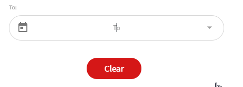
You can specify a date. Any data recorded before that will be cleared. If it is left empty, all the data for this "Content" will be cleared.
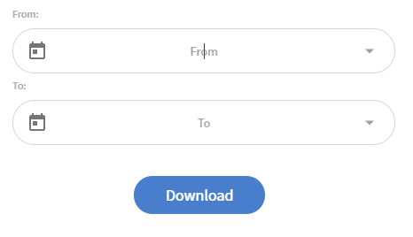
When downloading, you can specify a range. Only data between these dates will be added to the file. If left empty, all recorded data will be downloaded.
You can open this file with any software you usually use to open .xls files (such as Excel). Make sure to select "comma" as a separator! The spreadsheet will contain several columns: "Content id", "Content name", "Content comment", "Device id", "Device name" and "Timestamp" are always present. Other columns will be the "Button group" + "Event names" of your interactive widgets. Rows will contain the result of individual "Submit" presses.

If you select e-mail, you will need to set the receiver e-mail address. This can be set in one place for all the submit actions in the "Content". It is located in the left hand menu, around the bottom of the "Content" section.

Call API
If you need a more complicated calculation, need to fetch data from or save data to your own database, etc, you can call your own API as a submit action.
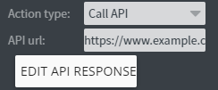
The request will be called as "POST", and the request body will contain the widgets' values as key-value pairs.

If you turn n the "Use button groups" option, the request body will change. On the first level, it will have the button groups and in each button group, the key-value pairs. All widgets without a button group will be in the "DefaultButtonGroup".
You can also set up all kinds of reactions in the "Edit API response" menu. Read more in this guide!
Sensor event
Sensor event will send the same data in the same format to the connected sensor interface as it would send as request body to an API. The "Use button groups" option also works the same. Read more about sensor here.
Interact with other widgets
Types of interaction on image, text and shape widgets
Some widgets (currently: "Image", "Text" and "Shape") can be turned into interactive buttons. There is an "Interaction" (previously known as "Jump") section in the "Other" tab of the "Properties" menu. If you select any of the "Click types", you widget will execute that action when pressed.

Jump to
When this button is pressed, the "Content" will jump to the selected "Page".

Popup
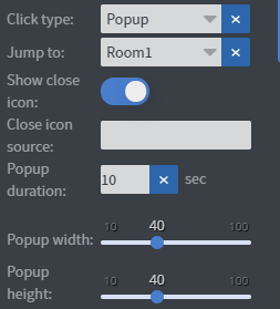
Alternatively, you can choose "Popup". The target also has to be a "Page" in the "Content". You can choose whether there will be a close icon, you can even choose an image to be the close icon. Also, can set a "Popup duration" to automatically close the popup. If it is empty, the popup can only be closed if the user touches the screen again (or from a sensor, api, touch or datasource event). The popup width and height, relative to the screen size (in percentages) can also be set.
Navigate
Navigation is similar to "Jump to" in that it also leaves the current "Page", but it also leaves the current "Content". Note that if you navigate to another "Content", your users will only be able to get back to the original "Content" if you also have a "Navigate" action there, pointing to this one.

Sensor event
You can send an output sensor event as well. If you have a sensor configured to react to this event, you can use it to trigger them.

Call API
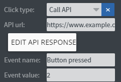
Your API will be called as "POST", and as request body, it will contain 2 key-value pairs, "Event name" and "Event value".

Touch actions Since v1.6
If you need anything more complex than these options, you can choose Actions and set up your own rules. They can range from interacting with other widgets to calling APIs or navigating to other pages.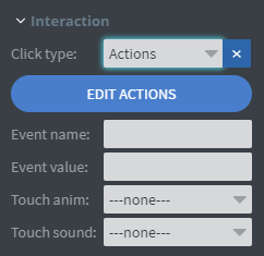
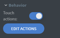
You can add jump, popup or navigate interactions here too.
Call API action can send a request directly to the API.
You can choose between GET and POST methods.
Static sensor event action can send out event values to sensors.

Touch actions Since v1.6
Action types
They work the same way as a sensor, API response, etc events. Read more about them here.
Behaviour
You can add several actions and all of them will be executed unless one of them is "Final". When a "Final" action is executed, all other actions after it will be ignored. For example, you can change some widgets' values on a different page, then jump to that page.
Depend on the value of interactive widgets

If you need different behaviour based on the value of some interactive widgets, you can turn on "Depend on the value of interactive widgets" and add all the widgets to the conditions. The conditions will only be evaluated for an action if it is not empty. For a "Checkbox", you need to type the "Checked event value" or the "Unchecked event value". User inputs need to match whatever the user typed in. You can also turn on the "Use regular expressions for values" to check for a valid pattern. "Radio buttons" will not be added individually, instead, as a "Button group". You will need to type the "Checked event value" of the selected "Radio button" in this "Button group".

"Final" actions will only stop the chain of execution, if their condition is true.
Tip: Let's say your user needs to accept the Terms of Service before being able to Subscribe. You can add a "Checkbox", name the layer to "Accept ToS" and a "Submit button", name it "Subscribe". Set up the subscription logic for your "Submit button" via an "API call". If you leave it at this stage, the user will be able to call the subscribe logic without checking the "Checkbox". You will still be able to handle it server-side, but if you want to give the user a quick reminder to accept the ToS, you can do that!
- Hide the "Submit button" from your user by moving it outside the Content's boundaries (drag it to the right side or the bottom).
- Add an "Image widget", select "Actions" and set it up like this:
- Add the Accept ToS widget as "Condition".
- Add two "Actions".
- The first "Action"
- will have the condition "true" (which is our "Checked event value" for the "Checkbox")
- will be "Interact widget", targeting our hidden "Submit button".
- needs to be set to "Final"
- The second "Action"
- doesn't need a condition, it will only happen if the other, "Final" action was not executed
- you can set up an action (for example, a "Popup" with a message that the ToS must be accepted) to inform your user about the problem.

Tip: If you are creating an especially complex content, sometimes it can be useful to put some "Checkboxes" outside the content boundaries and when something happens (for example, a user jumps to a page by clicking on an "Interactive" "Image widget"), use "Touch actions", add a "Jump to" action and an "Interact widget" action, targeting this invisible "Checkbox" and use the "Check" action (not "Toggle"!). This way, on any page, you can monitor whether the user already visited that page and set up conditions based on it. You can use this technique for any other type of action.
Slide master page improvements Since v1.6
If you use the Master Page inside your content (instead of a different Content), it will be faster than before version 1.6.
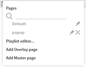
You can turn on the "Click through content" option in the "Content" properties menu, to be able to interact with widgets on the "Master Page". Widgets in your content still stay clickable. If you use some semi-transparent elements that you need to click through, you can turn on this option for individual widgets in the widget "Properties" menu, on the "Other" tab, usually in the "More" section. It is useful on touch screens, if you want to put interactive elements on to the master page, for example, your user is ordering something and you want to list the choices made on previous pages.


The interactive widgets ("Check boxes", "Radio buttons",...) on the "Master Page" will display the same data as their counterpart (if their "Button group", "Checked event value", etc... properties match) in the normal "Pages" of the "Content", it doesn't matter if the "Click through content" option is turned on or not.