Use-case: Simple birthday datasource example 2
Using table widget to display birthdays of the month
Display data in a simple table format
In this guide, we will use a Google Sheet, but, as usual, any type of datasource can be used, as long as it has a part that is similar to a table: It needs a list of objects and these objects need to have the same properties. In this case, we have a list of people and they all have properties “name” and “birthday”, as well as some random quotes.
Add a table widget and double click it to open the data picker. Select our datasource. We need to select a path at least to our table level and mark the small table icon next to the row with the indices.
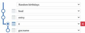
Note that if you connected the datasource as type Google Sheet, the structure of the data is already known and you won’t need to select it:

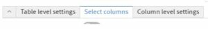
Next, go to the “Select columns” tab at the bottom of this window. We can also minimize the top part with the up arrow.
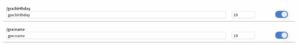
Select some columns, such as name and birthday.
Next, go to the “Column level settings” tab either by clicking it or the edit icon next to one of the selected columns.

We can make the name bold or give it a color if we want to. The birthday field is more interesting.
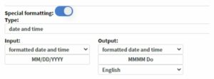
If we turn on Special formatting, we can change the display format. Let’s say we don’t want to display the year and want to write the month/day with letters.

Filter out people not born in the current month
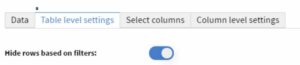
Open the data picker back up. This time, we will use the “Table level settings” tab and turn on “Hide rows based on filters”.
Add and set up a new rule.
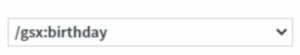
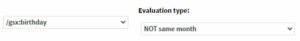
A column, select the birthday.
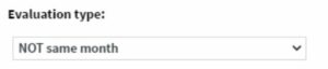
With these rules, we tell the table which rows to hide, so we need to select everyone who’s birthday we don’t want to display right now. So, set evaluation type to “NOT same month”. It is important choose this one, as “NOT this month” would also exclude anyone who was not born in the current month of the current year (in this case, everyone).
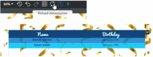
After saving, and maybe refreshing the datasource, our table will only show the rows it is supposed to.
Use a content widget for custom layout
No matter what we do with this table, it would still look like, well, a table. We can customize the layout of each row by using a content widget.
We use a page from a different content or just add a page in this one. In this tutorial, we will just add a new page here.
Add some widgets, images, backgrounds, colors here. We will use text widgets, but if you have picture URLs or file names in your datasource, you can also add images.
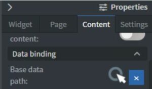
Set base data path
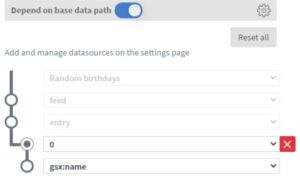
In the content we will use for the one-person layout, we need to set up base data path. Go to the content properties / Data binding section and open this data picker.
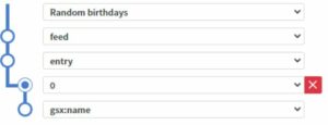
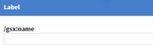
We need to select the same path we used for the table, and mark the level with the indices as pivot point. This time, it is also important to select the correct column (name or some kind of id) as the label. Label is anything selected below the pivot point.
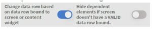
We also need to turn on “Change data row based on data row bound to screen or content widget” at the top of this window.
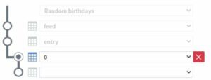
Now go to the layout page, add a text widget and open the data picker (from the Other tab of the widget menu or Shift + double click the widget). Notice that “Depends on base data path” is already checked for us and we only need to select the last two levels in the path.
Add as many widgets as you need. Make sure when you bind a widget to data, it “Depends on base data path”.
Use this page in the table widget
Let’s quickly go through the steps we need for the table widget again.
Add a table widget, open data picker (double click) and select our datasource. Make sure the table icon is next to the level with the indices (unless using Google Sheet).
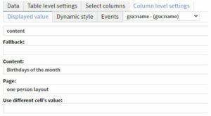
This time, we will only need on column in the “Select columns” tab. Select the same one we used as label for “Base data path”. In our case, it was the name.
On the “Column level settings” tab, select this column and set type to “content”. Select the content and the page where we set up the layout for one person.
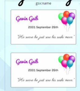
Now save it and refresh datasources on the page if needed. You should see something like this.
We still need to exclude people whose birthday is in other months, so open the data picker back up and turn on “Hide rows based on filters” on the “Table level settings” tab.

Add the same rule we used in the previous example. Column is birthday, and evaluation type is “NOT same month”.
If we save and refresh, we will see fewer cards, but they still show the same preview. It is because content widgets are not rendered in the editor. Save and open the preview to check if everything works correctly.

Note: The font colors are different in this example content, because it can also be bound to data and we just added some fun rules to make it more colorful, but its optional.
We should also hide the header. To achieve this, go back to the table’s data picker and on the “Select columns” tab and delete the label for the selected column.
Optional – automatic pagination
If the number of birthdays per month and your card’s aspect ratio doesn’t make it practical to stack all on top of each other, you can copy and paste the table widget multiple times and use “Limit rows”. For example, if we need to be able to display up to six cards, we can copy and paste the table two times, set “Only display” to 2 for each table and “Skip first … rows” to 0, 2 and 4 respectively.

Optional – multiple columns
If the number of birthdays per month and your card’s aspect ratio doesn’t make it practical to stack all on top of each other, you can copy and paste the table widget multiple times and use “Limit rows”. For example, if we need to be able to display up to six cards, we can copy and paste the table two times, set “Only display” to 2 for each table and “Skip first … rows” to 0, 2 and 4 respectively.