Table Widget
![]()
Note: this section is only visible if you have any kind of datasource already set up, as they can't work without connected data.
With the Table widget you can display your datasources in your content in table format.
You can use the Data binding tool to select your Datasource.

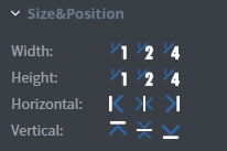
In the Size & Position menu you can select the width, height, and placement of your widget quickly.

In the Effects menu you can select a background image or color for your widget.

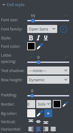
In the Cell Style menu you can set the vsize, family, style, and *color of the font in the table cells.
- You can also set letter spacing, text shadow, and row height for the cells.
- You can add padding, border, and background color.
- You can set the vertical and horizontal alignment for the cells.

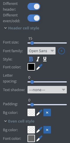
If you select Different header and Different even/odd, two more menus will appear.
- Header cell style menu allows you to customize the header of the table.
- You can set a different font size, family, style, color, letter spacing, and text shadow for the text in the header. See more specified information about Font.
- You can also set a different padding and background color from the rest of the table.
- Even cell style allows you to give different background and font colors for every second row of the table.
