RSS Custom Widget
Geomant does not support this feature at this time. For more information, please contact us at supportdesk@geomant.com.
Please keep in mind this widget is in BETA.

Types of compatible feeds:
- rss.app or videoelephant URL (directly as a feed URL)
- rss.app or videoelephant URL (as a wallboard RSS type datasource)
- rss.app or videoelephant URL (as a wallboard LiveDatasource type datasource)
- custom spreadsheet (as a wallboard XML type datasource)
- custom internal datasource
- custom mock datasource
- any other custom datasource following the custom JSON feed structure guidelines.
Connecting feeds directly
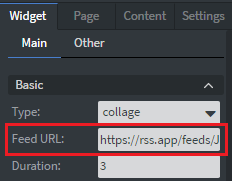
Copy and paste your rss.app or videoelephant URL directly into the widget’s Feed URL parameter.
Creating custom feeds
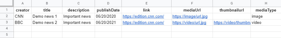
For spreadsheets you must have the following columns with these exact headers:
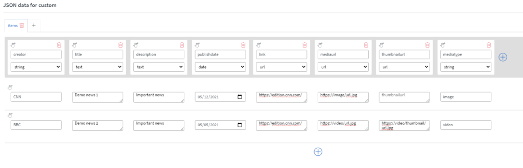
For internal datasources you must have the following columns with these exact column names and types:
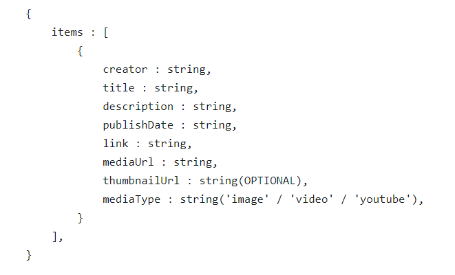
Custom feed structure:
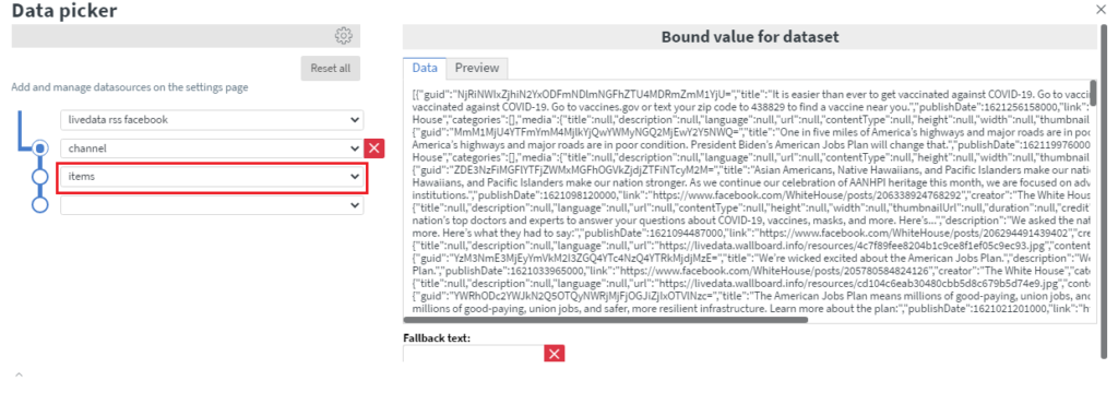
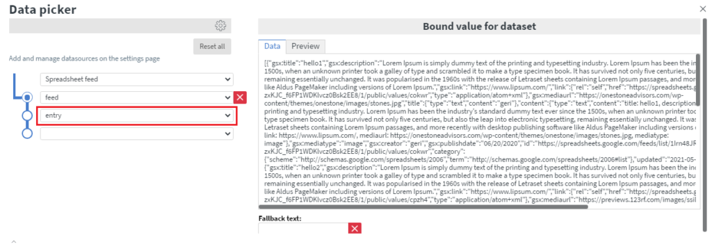
Connecting Datasource feeds
Make sure the Feed URL parameter is empty for this option to work.
Select the level in your datasource where your items are:
RSS type datasources:
Spreadsheet type datasources:
Parameter list
Basic
- Type: either slide or collage for different display modes
- Feed URL: rss.app or videoelephant feed URL (leave it blank when using a datasource)
- Duration: delay between change animations. (in a second) Also controls sync. Slide type rss-widgets with the same duration will be synced. Set to zero for a static display mode
- Direction: which way to change the cards in slide mode
- Orientation: orientation of the media and the text content
- Date format: format of the displayed publish date
- Mute: mute videos
- Send sensor events: widgets sends events to the content as sensor events when enabled
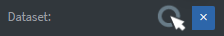
- Dataset: connect wallboard datasource (only works when the feed URL parameter is empty)
Show-hide
- Media: show hide the media part of the widget
- Creator: show hide the creator part of the widget
- Title: show hide the title part of the widget
- Description: show hide the description part of the widget
- Date: show hide the publish date part of the widget
- Url: show hide the original post URL part of the widget
Filter
- Start index: the widget will start displaying items from this index
- Skip: deletes the first X item
- Limit: controls the maximum amount of items in the feed
- Skip before: deletes all items published before this date
- Keyword: deletes all items that do not contain the keyword in any of its fields
- Title character limit: limits the character number of the title
- Description character limit: limits the character number of the description
Colors
- Title font: font color of the title text
- Description font: font color of the description text
- Creator font: font color of the creator text
- Background: the color of the background
- Panel: the color of the panel behind the text contents
- Creator: the color of the creator panel behind the creator text
- Transparent: full transparent mode (all color settings will be ignored)
Alignment
- Media fit: option to change the fitting of the media in its container
- Title text alignment: alignment of the title text in its container
- Description text alignment: alignment of the description text in it’s container
Font
- Custom font-size: custom font size in pixel (set to zero for automatic font size calculation)
- Font family: custom font family for all the displayed text (might be different depending on the displaying device’s font library)
Collage specific
- Columns: number of columns to display in collage mode
- Rows: number of rows to display in collage mode
- Padding ratio: padding for each card (% value)
- Rounding: rounding for each card (% value)
- Border width: border with for each card (px value)
- Border color: border-color for each card in collage mode
Available sensor events
Input
- To be implemented…
Output
- To be implemented…