Media Element

With the Media element, you can display data in an interesting and eye-catching way.
There are three ways you can feed the data to the element: datasource, folder, and loop. You can choose from these three in the Source menu.
Datasource lets you bind the element to a datasource, which can be either a systemwide datasource, your own datasource, or a predefined live datasource.
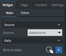
Hovewer be aware, that only the Live datasources are parsed automatically, therefore using your own datasource needs a bit of tweaking. See more about Data binding.
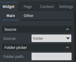
Folder lets you select a folder path from the File Manager, and use that folder as the basis of the Media element.
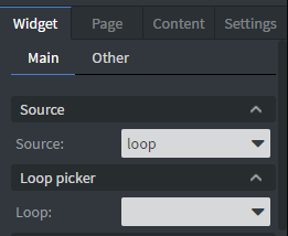
Loop lets you select from your Loops. See more about Loop editor..
Media element has many customizable options regarding its appearance. It can be daunting to set it up. That is why we prepared preset options, to make the first set-up as smooth as possible. These presets showcase the wide variety of the element’s flexibility.

Default preset
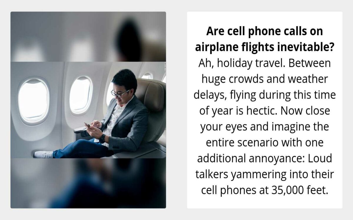
Preset 1
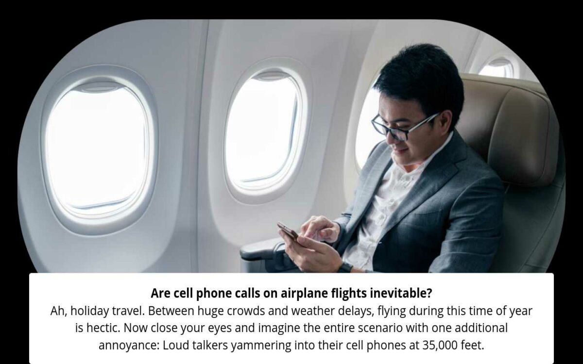
Preset 2
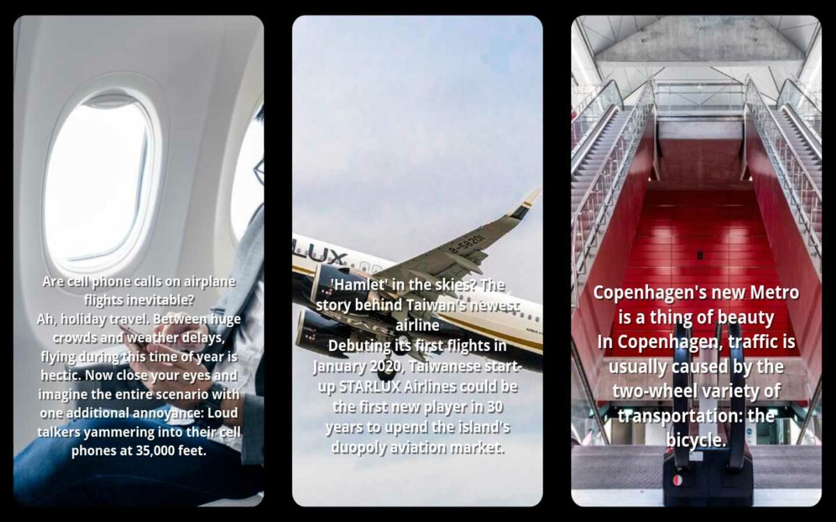
Preset 3
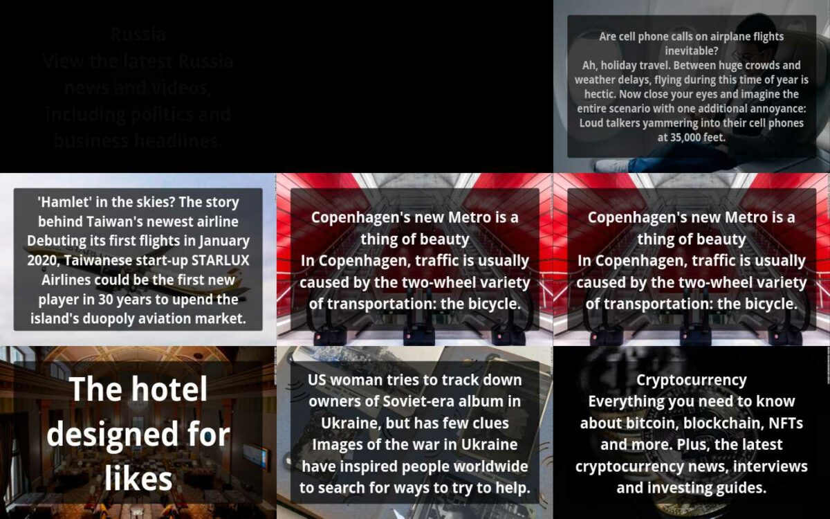
After selecting a preset you can further customize your element, with Feed and Slider/Collage mode options.
Feed option has Display mode, which determines the generic behavior of the element, as well as Slider/Collage mode options.
There are three Display modes: Slider, Continuous Slider, Collage.
Slider is a basic slider, that arranges one card on the screen, then scrolls it according to the Slide type. This type is showcased by Default and Preset 1.
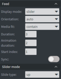
Continous slider enables you to arrange more than one slide on the screen, and have them continuously scroll through according to Slide type direction. This type is showcased by Preset 2.
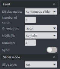
Collage arranges many cards on-screen and animates them according to Collage mode options. This type is showcased by Preset 3.
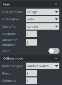
In the Size & Position menu, you can select the width, height, and placement of your element quickly. See more about Size&Position.
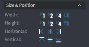
Style lets you further customize the element’s look, such as spacings, corner roundings, and borders.
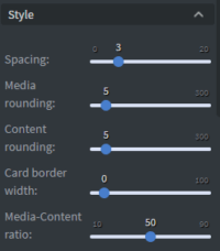
Padding can also be set under the style. The basic set-up of padding changes the size of the padding all around (all four sides) equally.
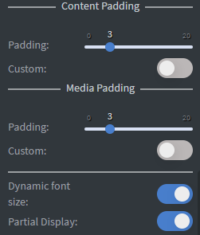
If Dynamic font size is enabled then the element automatically calculates the font size of each card according to the card size, and the text inside. This option overrides the size setting of fonts. See more about Using Fonts & Custom Fonts
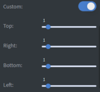
If Custom padding is enabled, then you can customize the padding on all four sides separately.
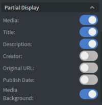
If Partial Display is enabled, then you can customize which part of the element is shown.
