General Components of an Excel Report
Contact Expert v6.1 for Skype for Business Server
Excel is used as a report building and presentation tool based on the complex Power Pivot data model. Reports can be built using standard Excel tools:
- Pivot tables
- Pivot charts
- Slicers
- Timelines
Using some extra know-how one can even build free form reports.
Pivot tables
Pivot table is a data summarization and visualization tools in Excel and in other spreadsheets and business intelligence software. Among other functions, a pivot table can automatically sort, count, total or give the average of the data stored in one table or spreadsheet, displaying the results in a second table showing the summarized data. Pivot tables are also useful for quickly creating unweighted cross tabulations. The user sets up and changes the summary's structure by dragging and dropping fields graphically. This "rotation" or pivoting of the summary table gives the concept its name. Pivot tables are integral parts of Microsoft Excel since 1994.
Pivot tables can be created based on data tables within Excel itself or based on external data. Creating Excel pivot tables based on Power Pivot data model is kind of in-between. The Power Pivot data model is external for the Excel application, but it is stored within the same Excel (XLS) file.

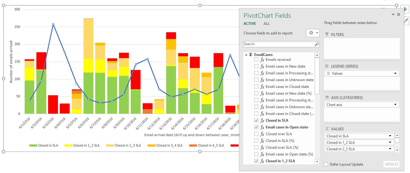
Pivot charts
A pivot chart is a data analysis tool that enables one to visualize a pivot table. It is a built-in feature of Microsoft Excel and Microsoft Access.
Slicers
One can use traditional report filters to filter data in an Excel pivot table report, but it is not easy to see the current filtering state when you filter on multiple items. As an alternative you have the option to use slicers to filter the data. Slicers provide buttons that you can click to filter pivot tables. In addition to quick filtering, slicers also indicate the current filtering state, which makes it easy to understand what exactly is shown in a filtered pivot table.
Further readings:
 {.image-right}
Timelines
Instead of playing around with filters to show dates, you can now use a pivot table timeline in Excel. Timeline is a box you can add to pivot tables that lets you filter by time, and zoom in on the period you want. You can define contiguous date ranges on year, quarter, month and on day level.
Further readings:
Free form presentation
Sometime one might want to create free form reports instead of pivot tables or pivot charts. This is possible by manually designing your report cell by cell in Excel and place special data cube functions into the cells you want to display data from the Power Pivot data model.
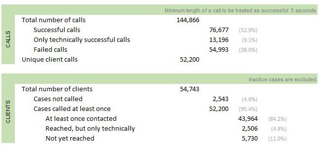
The picture on the right shows such a free form report. The cell for "Failed calls" in that report contains the following Excel cube function:
<![CDATA[=CUBEVALUE( "ThisWorkbookDataModel", "[Measures].[Calls failed]", Slicer_Campaign_name, Slicer_Calendar_Year2, Slicer_Readable_day2)
The function parameters refer to the Power Pivot data model within the workbook (not an online external data model), defines the appropriate measure name and also apply slicer filters used on the report page.
Further readings: