BI Reporting Overview
Contact Expert v6.1 for Skype for Business Server
Microsoft Personal BI Reporting Environment
Power Pivot is an integral component of Microsoft Excel 2013/2016 and an optional downloadable free add-on for Excel 2010. It extends the capabilities of the pivot table, pivot chart and cross-tabulation feature with new features such as expanded data capacity, advanced calculations, ability to import data from multiple sources, and the ability to publish the workbooks as interactive web applications. Power Pivot realizes part of the server based SQL Server Analysis Services as a flexible, in-memory "tabular" database engine that is capable of effectively handling tens of millions of data records on desktop computers and laptops.

Power View is an alternative presentation layer of Microsoft Excel that makes report handling and presentation even more intuitive. Power View adds new possibilities to present time series and geographical data in a format that was so far available only in the most advanced data analysis tools.
Power Map is yet another alternative presentation layer in Excel. With Power Map data that are linked to geographical locations (GPS coordinates, city, country or area names etc.) can be visually presented on the maps directly including 3D rotation possibilities and temporal simulations.

Power Pivot neatly fits into Microsoft’s rich BI solutions ecosystem. Technologies used to build personal BI reports with Power Pivot for Excel can be re-used to share and create reports for workgroups and for the whole enterprise. SharePoint can hold, refresh and distribute Power Pivot reports that could be accessed via simple browsers. The new Power BI environment uses the very same reporting technology outside of Excel and enhances the Power View presentation capabilities that could be accessed via web.
Further readings:
- Power Pivot Help (Office.com)
- What is PowerPivot? (PowerPivotPro blog)
- PowerPivot vs. Power View: What’s the Difference? (PowerPivotPro blog)
- Announcing Power BI for Office 365 (Office blogs)
Books:
- Microsoft Excel 2013 Building Data Models with PowerPivot
- High Impact Data Visualization with Power View, Power Map, and Power BI
- DAX Formulas for PowerPivot: A Simple Guide to the Excel Revolution

Components of Contact Expert BI Reporting Tool
CE BI reporting is not a fixed product, but more a tool set. It enables the user to flexibly create his own BI datamodel and reports. To facilitate this avtivity we provide a basic CE data model and several samples. Components of the Contact Expert BI reporting tool set are as follows:
- De-normalized MS SQL database views prepared for data mining and business intelligence reporting.
- Sample Excel Power Pivot data model that extends the MS SQL views with calculated columns and complex measures (a.k.a. calculated fields) that can be used in custom pivot tables, calculations and graphs. The data model can be freely modified and extended with new calculated columns and measures.
Sample Power Pivot and Power View reports.
Detailed documentation of the database views and Power Pivot data model discussing agent, interaction and campaign states.
Power users can create reports to the users using their own Excel application and refreshing the data from the MS SQL database views. The reports can be distributed as refreshable interactive Excel files, as PDF files, or as illustrations in Power Point or MS Word documents.

Knowledge Required to Use and Manage BI Reporting
BI reporting is not simple, though Power Pivot alone makes the learning investment worthwhile. All tools required are pretty much already present on the desktop of every contact center manager, supervisor and data analyst. However using the solution effectively requires training and technical knowledge. The following table attempts to summarize the type of knowledge the different report users should acquire.
| User type | Knowledge | Resources |
|---|---|---|
| Simple report users | No extra know-how is required beyond simple Excel knowledge. These users will just open the Excel files containing the prepared reports and use the reports by possibly manipulating with some filters, and other parameters. | |
| Users creating their own reports | Creating new reports based on the underlining Power Pivot data model requires simple Excel pivot creation and handling knowledge. No Power Pivot know-how is required. | Excel 2013 Pivot tables |
| Data analysts | More advanced users might change the Power Pivot data model by linking other business data (customer data from CRM, agent employment and cost data etc.) to the CE data tables, by creating new measures, KPIs or modifying existing ones (which call counts as abandoned, how to calculate agent utilization etc.). These users should have some level of MS Power Pivot training including know-how about the Data Analysis Expressions (DAX) language. For those already using Excel expressions DAX will be familiar, however fully mastering DAX requires some efforts. A basic understanding of MultiDimensional Expressions (MDX, used to access OLAP databases and cubes) is also useful. |
General Components of a Power Pivot data model
Power Pivot realizes part of the server based SQL Server Analysis Services as a flexible, in-memory "tabular" database engine that is capable of effectively handling tens of millions of data records on desktop computers and laptops. It works together with Excel to provide a unique analytical database - reporting tool pair.
One can create a complex data model in Power Pivot with the following main components:
- Data tables with potentially millions of data records imported from external data sources of various kinds
- Relationships among the tables
- Calculated columns extending the imported tables
- Measures (a.k.a. calculated fields) summarizing data using simple or complex logic based on several records and tables.
- Key performance indicators (KPIs) to visually present performance values calculated by measures
These table columns, measures and KPIs are used in Excel to build complex pivot tables, pivot charts and free form reports.
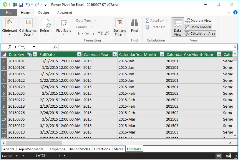
Data tables
Data is stored in Power Pivot in the form of data tables. Each table is shown on a separate tab within the Power Pivot application. These data are replicas of some external data source like tables from relational databases, from other Excel files, from ASCII files and from many other possible data sources including data provided online on the Internet.
The data is presented in rows (records) and each row consists of one or multiple columns (fields). The data tables - more specifically the records - can be extended adding calculated columns and the individual data tables can be linked together using relationships.
 {.image-right width="290"}
Relationships
In MS Excel one might create links between tables using the VLOOKUP function. However this solution has some limitations and becomes practically unmanageable when dealing with many tables and many records in the tables. Power Pivot provides a solution for this problem. One might set up relationships between tables as it is done in relational database management systems. Relationships are limited to one-to-many types. Many-to-many relationships could be managed using some more advanced tricks.
In BI reporting the source data is generally partially de-normalized, thus less lookup tables and relations are required. However it does not mean that one will/should not use relationships at all. Setting up such relationships between the data tables can be done using the Diagram View of Power Pivot.
Further readings:
- Relationships Overview (MSDN)
{.image-right width="290"}
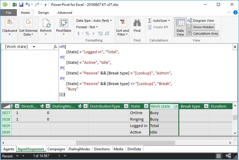
Calculated Columns
With calculated columns, you can add new data to a table in your Power Pivot Data Model using Data Analysis Expressions (DAX) formula. This is similar to adding a calculated column in an ordinary Excel table. There are several differences though. Column cells are not treated individually, i.e. it is not possible to enter different expressions into the cells of the column. You define the calculation expression for the entire column.
Further readings:
 {.image-right width="290"}
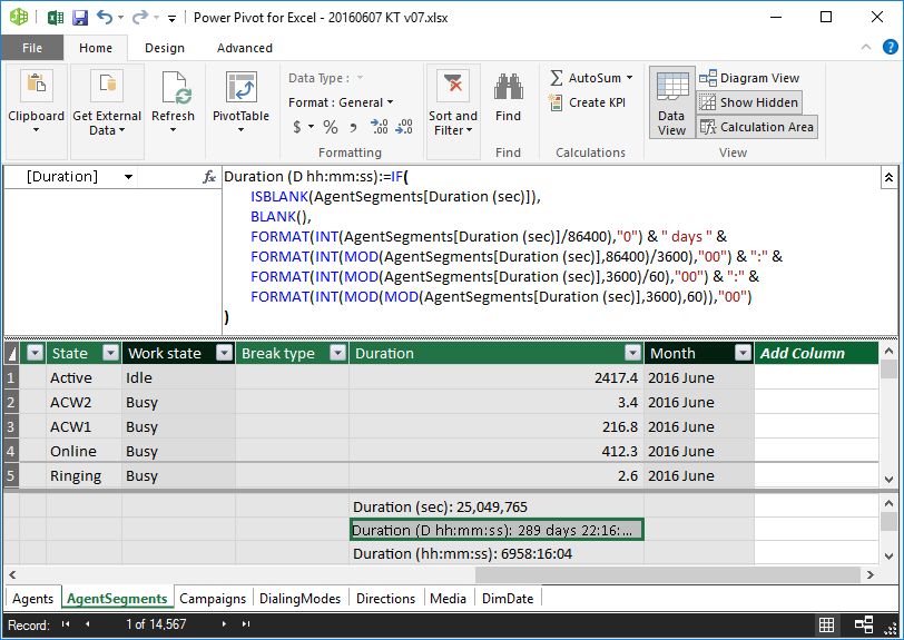
Calculated fields (measures)
Calculated fields, also known as measures in earlier versions of Power Pivot, are calculations used in data analysis. Unlike calculated columns, calculated fields perform calculations on many records (rows) in the database. Examples commonly found in business reports include sums, averages, minimum or maximum values, counts, or more advanced calculations that you create using a Data Analysis Expressions (DAX) formula.
Further readings:
 {.image-right width="290"}
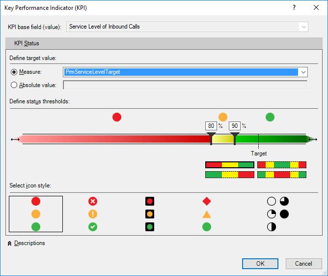
Key Performance Indicators (KPIs)
Key performance indicators (KPIs) are visual measures of performance. Based on a specific calculated field, a KPI is designed to help users quickly evaluate the current value and status of a metric against a defined target. The KPI gauges the performance of the value, defined by a Base calculated field, against a Target value, also defined by a calculated field or by an absolute value. Of course this means that before using a KPI, you should have a calculated field created for which you implement the KPI visualization.
Further readings:
 {.image-right width="290"}
General Components of an Excel Report
Excel is used as a report building and presentation tool based on the complex Power Pivot data model. Reports can be built using standard Excel tools:
- Pivot tables
- Pivot charts
- Slicers
- Timelines
Using some extra know-how one can even build free form reports.
Pivot tables
Pivot table is a data summarization and visualization tools in Excel and in other spreadsheets and business intelligence software. Among other functions, a pivot table can automatically sort, count, total or give the average of the data stored in one table or spreadsheet, displaying the results in a second table showing the summarized data. Pivot tables are also useful for quickly creating unweighted cross tabulations. The user sets up and changes the summary's structure by dragging and dropping fields graphically. This "rotation" or pivoting of the summary table gives the concept its name. Pivot tables are integral parts of Microsoft Excel since 1994.
Pivot tables can be created based on data tables within Excel itself or based on external data. Creating Excel pivot tables based on Power Pivot data model is kind of in-between. The Power Pivot data model is external for the Excel application, but it is stored within the same Excel (XLS) file.

Pivot charts
A pivot chart is a data analysis tool that enables one to visualize a pivot table. It is a built-in feature of Microsoft Excel and Microsoft Access.
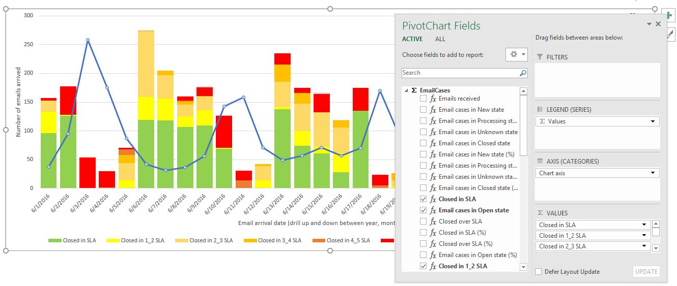
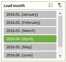
Slicers
One can use traditional report filters to filter data in an Excel pivot table report, but it is not easy to see the current filtering state when you filter on multiple items. As an alternative you have the option to use slicers to filter the data. Slicers provide buttons that you can click to filter pivot tables. In addition to quick filtering, slicers also indicate the current filtering state, which makes it easy to understand what exactly is shown in a filtered pivot table.
Further readings:
 {.image-right}
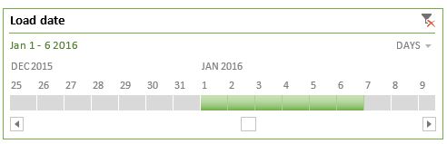
Timelines
Instead of playing around with filters to show dates, you can now use a pivot table timeline in Excel. Timeline is a box you can add to pivot tables that lets you filter by time, and zoom in on the period you want. You can define contiguous date ranges on year, quarter, month and on day level.
Further readings:
Free form presentation
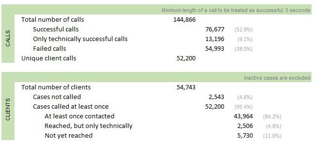
Sometime one might want to create free form reports instead of pivot tables or pivot charts. This is possible by manually designing your report cell by cell in Excel and place special data cube functions into the cells you want to display data from the Power Pivot data model.
The picture on the right shows such a free form report. The cell for "Failed calls" in that report contains the following Excel cube function:
<![CDATA[=CUBEVALUE( "ThisWorkbookDataModel", "[Measures].[Calls failed]", Slicer_Campaign_name, Slicer_Calendar_Year2, Slicer_Readable_day2)
The function parameters refer to the Power Pivot data model within the workbook (not an online external data model), defines the appropriate measure name and also apply slicer filters used on the report page.
Further readings: